
2024
Grey & White
Branding, web, and digital strategy for Florida’s impact window & door experts.
Performance Marketing
B2B Branding Experience
Overview
We refined and expanded an existing identity, designed and launched a high-converting website, and built a digital strategy to help Grey & White grow as experts in impact window and door installation.
About the Brand
Grey & White Solutions is a Florida-based company specializing in the installation of high-performance impact windows and doors. Known for their precision, compliance, and customer service, the brand needed a system that could reflect their professionalism while adapting across sales, digital marketing, and client communications.
As the business scaled, it became clear that they needed more than a logo—they needed structure, alignment, and digital tools to match their ambition.

What We Did
Although Grey & White already had the foundation of a visual identity (logo and typography), it lacked the clarity and consistency needed to perform across formats. Typography choices presented legibility issues in both digital and printed applications, and there was no unified system guiding color, composition, or messaging.
We began by auditing the brand’s assets and identifying points of friction. From there, we refined the existing identity and built a scalable visual system. Once the brand foundation was solid, we led the design and development of a fully functional website and developed an aligned digital content strategy—including creative direction and assets for paid media.
This strategic evolution touched three core areas:
Brand Identity Expansion
We optimized the original system and expanded it into a more robust, flexible and functional toolkit:
Modular logo system with flexible positioning for different formats
Updated typographic hierarchy to improve clarity and consistency
Refined color palette based on trust-driven analog blues and coastal tones
A graphic language based on shapes (arches, squircle, semicircles) symbolizing structure, protection and flow
UI guidelines for social media, print, and digital usage
Website Design & Development
We built the website not just as a presence, but as a growth engine. Designed in Wix, the site combines UX best practices, SEO strategy and high-conversion architecture.
Key elements:
SEO-driven sitemap and user journeys
Custom UI kit with scalable responsive design
Meta Pixel, Google Analytics and forms fully integrated
Performance-optimized layouts for lead generation, credibility, and conversion
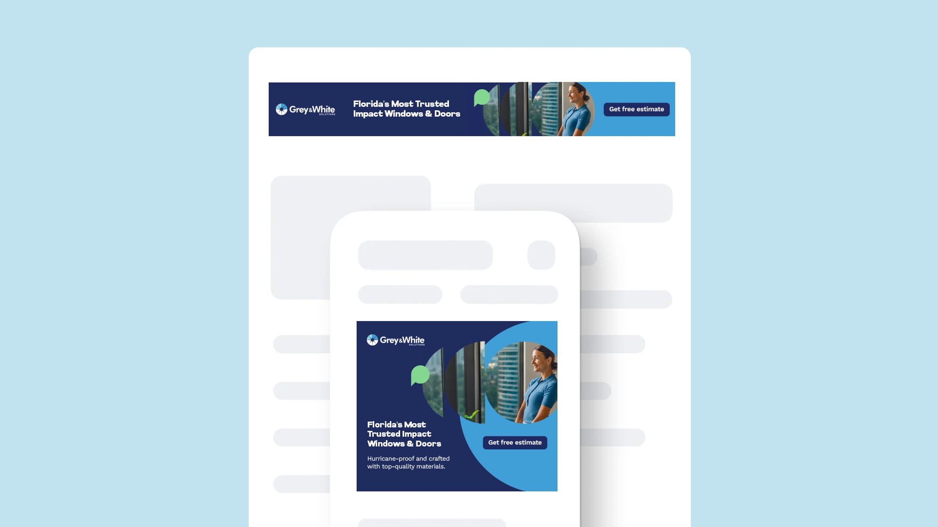
Social Media & Paid Media Strategy
We crafted a visual and editorial strategy for Instagram, Facebook, TikTok and LinkedIn—maintaining consistency while adapting to each platform’s tone and behavior.
Design of branded content templates and formats
Visual consistency across feed, stories and reels
Content calendar aligned with service offerings and business goals
Paid media creatives developed for Meta and Google platforms
Iterative asset updates based on engagement and performance data

Creative Direction
Clarity, trust and transformation—built visually.
Our creative direction was rooted in translating the essence of Grey & White’s service—protection, precision, and transparency—into a cohesive visual and emotional experience. We understood that their work goes beyond installing windows and doors: it’s about creating secure, durable, and beautiful spaces, and the brand needed to reflect that in every interaction.
We designed a system that blends architectural structure with emotional clarity. The palette of analog blues evokes trust, calm, and coastal reliability—essential in the Florida market. Structured shapes like arches, semicircles, and squircles reference both physical protection and visual openness, mirroring the idea of letting light in while keeping people safe.
The typography system was recalibrated to balance professionalism with readability—ensuring that whether it’s a printed quote, a website banner, or a story post, the message always lands with clarity and confidence.
We extended this direction across photography, motion, layout behavior and tone of voice, ensuring the brand felt consistent and strong across static and interactive environments. Visuals were kept modern and minimal, highlighting real people, real installs, and clean environments—reinforcing the company's reliability and human approach.
Every asset—from the way a CTA button animates on the site, to how a testimonial post is framed on Instagram—was intentionally designed to support the brand’s positioning as a technical partner with heart.
Ultimately, the creative system gave Grey & White a platform that wasn’t just beautiful—it was smart, scalable, and ready to grow with the business.

Concept
Building a system to scale with clarity, consistency, and purpose.
Grey & White’s growth required more than isolated assets—it needed a comprehensive brand system that could operate across formats, platforms, and contexts with consistency and adaptability. Our approach fue más allá de lo visual: diseñamos un sistema estratégico que diera dirección clara a la marca en términos de expresión, jerarquía, comportamiento y usabilidad.
Logo System
We optimized the use of the existing logo by defining correct applications, scalable formats, and use cases for both the logotype and isotype across print, digital, and social. We also ensured responsive behavior and clarity at small sizes.Color Strategy
The color palette was refined and strategically organized into primary, secondary, and accent tones. Coastal blues and neutral whites project confidence, professionalism and cleanliness, while subtle accents allow flexibility in digital environments and content design.Typography Hierarchy
We rebuilt the typographic system to improve hierarchy, contrast, and legibility. Glancyr became the brand’s voice for headlines—structured and architectural—while Work Sans ensured clarity in longer reading formats, UI, and small spaces.Graphic Language
We created a set of graphic shapes (arches, semicircles, squircles) inspired by architectural principles and product metaphors—used to frame content, guide the eye, or bring rhythm to layouts. These elements became key to the brand’s storytelling and structure.Digital Component Library
A modular system of web components was designed to support service pages, forms, testimonials, blog layouts, and landing sections. Built with scalability in mind, this system allows G&W to grow its digital presence without losing consistency.Cross-Platform Behavior
Every rule was documented to ensure consistency across channels—from print brochures and uniforms, to social media templates, digital ads, and the website. This empowered the internal team to activate the brand with confidence and efficiency.
This strategic foundation became the brand’s engine—a living system ready to support G&W’s long-term growth in the Florida impact installation industry and beyond.
More Works
(GQ® — 02)
©2024

FAQ
01
How do you work with clients?
02
What’s your typical project timeline?
03
Do you offer strategy only services?
04
What makes you different from traditional agencies?
05
Are you really that involved in the process?
06
Can we start small and grow from there?
07
Do you have experience in our industry?
08
Can you help if we already have an internal team?
2024
Grey & White
Branding, web, and digital strategy for Florida’s impact window & door experts.
Performance Marketing
B2B Branding Experience
Overview
We refined and expanded an existing identity, designed and launched a high-converting website, and built a digital strategy to help Grey & White grow as experts in impact window and door installation.
About the Brand
Grey & White Solutions is a Florida-based company specializing in the installation of high-performance impact windows and doors. Known for their precision, compliance, and customer service, the brand needed a system that could reflect their professionalism while adapting across sales, digital marketing, and client communications.
As the business scaled, it became clear that they needed more than a logo—they needed structure, alignment, and digital tools to match their ambition.
What We Did
Although Grey & White already had the foundation of a visual identity (logo and typography), it lacked the clarity and consistency needed to perform across formats. Typography choices presented legibility issues in both digital and printed applications, and there was no unified system guiding color, composition, or messaging.
We began by auditing the brand’s assets and identifying points of friction. From there, we refined the existing identity and built a scalable visual system. Once the brand foundation was solid, we led the design and development of a fully functional website and developed an aligned digital content strategy—including creative direction and assets for paid media.
This strategic evolution touched three core areas:
Brand Identity Expansion
We optimized the original system and expanded it into a more robust, flexible and functional toolkit:
Modular logo system with flexible positioning for different formats
Updated typographic hierarchy to improve clarity and consistency
Refined color palette based on trust-driven analog blues and coastal tones
A graphic language based on shapes (arches, squircle, semicircles) symbolizing structure, protection and flow
UI guidelines for social media, print, and digital usage
Website Design & Development
We built the website not just as a presence, but as a growth engine. Designed in Wix, the site combines UX best practices, SEO strategy and high-conversion architecture.
Key elements:
SEO-driven sitemap and user journeys
Custom UI kit with scalable responsive design
Meta Pixel, Google Analytics and forms fully integrated
Performance-optimized layouts for lead generation, credibility, and conversion
Social Media & Paid Media Strategy
We crafted a visual and editorial strategy for Instagram, Facebook, TikTok and LinkedIn—maintaining consistency while adapting to each platform’s tone and behavior.
Design of branded content templates and formats
Visual consistency across feed, stories and reels
Content calendar aligned with service offerings and business goals
Paid media creatives developed for Meta and Google platforms
Iterative asset updates based on engagement and performance data
Creative Direction
Clarity, trust and transformation—built visually.
Our creative direction was rooted in translating the essence of Grey & White’s service—protection, precision, and transparency—into a cohesive visual and emotional experience. We understood that their work goes beyond installing windows and doors: it’s about creating secure, durable, and beautiful spaces, and the brand needed to reflect that in every interaction.
We designed a system that blends architectural structure with emotional clarity. The palette of analog blues evokes trust, calm, and coastal reliability—essential in the Florida market. Structured shapes like arches, semicircles, and squircles reference both physical protection and visual openness, mirroring the idea of letting light in while keeping people safe.
The typography system was recalibrated to balance professionalism with readability—ensuring that whether it’s a printed quote, a website banner, or a story post, the message always lands with clarity and confidence.
We extended this direction across photography, motion, layout behavior and tone of voice, ensuring the brand felt consistent and strong across static and interactive environments. Visuals were kept modern and minimal, highlighting real people, real installs, and clean environments—reinforcing the company's reliability and human approach.
Every asset—from the way a CTA button animates on the site, to how a testimonial post is framed on Instagram—was intentionally designed to support the brand’s positioning as a technical partner with heart.
Ultimately, the creative system gave Grey & White a platform that wasn’t just beautiful—it was smart, scalable, and ready to grow with the business.
Concept
Building a system to scale with clarity, consistency, and purpose.
Grey & White’s growth required more than isolated assets—it needed a comprehensive brand system that could operate across formats, platforms, and contexts with consistency and adaptability. Our approach fue más allá de lo visual: diseñamos un sistema estratégico que diera dirección clara a la marca en términos de expresión, jerarquía, comportamiento y usabilidad.
Logo System
We optimized the use of the existing logo by defining correct applications, scalable formats, and use cases for both the logotype and isotype across print, digital, and social. We also ensured responsive behavior and clarity at small sizes.Color Strategy
The color palette was refined and strategically organized into primary, secondary, and accent tones. Coastal blues and neutral whites project confidence, professionalism and cleanliness, while subtle accents allow flexibility in digital environments and content design.Typography Hierarchy
We rebuilt the typographic system to improve hierarchy, contrast, and legibility. Glancyr became the brand’s voice for headlines—structured and architectural—while Work Sans ensured clarity in longer reading formats, UI, and small spaces.Graphic Language
We created a set of graphic shapes (arches, semicircles, squircles) inspired by architectural principles and product metaphors—used to frame content, guide the eye, or bring rhythm to layouts. These elements became key to the brand’s storytelling and structure.Digital Component Library
A modular system of web components was designed to support service pages, forms, testimonials, blog layouts, and landing sections. Built with scalability in mind, this system allows G&W to grow its digital presence without losing consistency.Cross-Platform Behavior
Every rule was documented to ensure consistency across channels—from print brochures and uniforms, to social media templates, digital ads, and the website. This empowered the internal team to activate the brand with confidence and efficiency.
This strategic foundation became the brand’s engine—a living system ready to support G&W’s long-term growth in the Florida impact installation industry and beyond.
More Works
(GQ® — 02)
©2024
FAQ
01
How do you work with clients?
02
What’s your typical project timeline?
03
Do you offer strategy only services?
04
What makes you different from traditional agencies?
05
Are you really that involved in the process?
06
Can we start small and grow from there?
07
Do you have experience in our industry?
08
Can you help if we already have an internal team?
2024
Grey & White
Branding, web, and digital strategy for Florida’s impact window & door experts.
Performance Marketing
B2B Branding Experience
Overview
We refined and expanded an existing identity, designed and launched a high-converting website, and built a digital strategy to help Grey & White grow as experts in impact window and door installation.
About the Brand
Grey & White Solutions is a Florida-based company specializing in the installation of high-performance impact windows and doors. Known for their precision, compliance, and customer service, the brand needed a system that could reflect their professionalism while adapting across sales, digital marketing, and client communications.
As the business scaled, it became clear that they needed more than a logo—they needed structure, alignment, and digital tools to match their ambition.
What We Did
Although Grey & White already had the foundation of a visual identity (logo and typography), it lacked the clarity and consistency needed to perform across formats. Typography choices presented legibility issues in both digital and printed applications, and there was no unified system guiding color, composition, or messaging.
We began by auditing the brand’s assets and identifying points of friction. From there, we refined the existing identity and built a scalable visual system. Once the brand foundation was solid, we led the design and development of a fully functional website and developed an aligned digital content strategy—including creative direction and assets for paid media.
This strategic evolution touched three core areas:
Brand Identity Expansion
We optimized the original system and expanded it into a more robust, flexible and functional toolkit:
Modular logo system with flexible positioning for different formats
Updated typographic hierarchy to improve clarity and consistency
Refined color palette based on trust-driven analog blues and coastal tones
A graphic language based on shapes (arches, squircle, semicircles) symbolizing structure, protection and flow
UI guidelines for social media, print, and digital usage
Website Design & Development
We built the website not just as a presence, but as a growth engine. Designed in Wix, the site combines UX best practices, SEO strategy and high-conversion architecture.
Key elements:
SEO-driven sitemap and user journeys
Custom UI kit with scalable responsive design
Meta Pixel, Google Analytics and forms fully integrated
Performance-optimized layouts for lead generation, credibility, and conversion
Social Media & Paid Media Strategy
We crafted a visual and editorial strategy for Instagram, Facebook, TikTok and LinkedIn—maintaining consistency while adapting to each platform’s tone and behavior.
Design of branded content templates and formats
Visual consistency across feed, stories and reels
Content calendar aligned with service offerings and business goals
Paid media creatives developed for Meta and Google platforms
Iterative asset updates based on engagement and performance data
Creative Direction
Clarity, trust and transformation—built visually.
Our creative direction was rooted in translating the essence of Grey & White’s service—protection, precision, and transparency—into a cohesive visual and emotional experience. We understood that their work goes beyond installing windows and doors: it’s about creating secure, durable, and beautiful spaces, and the brand needed to reflect that in every interaction.
We designed a system that blends architectural structure with emotional clarity. The palette of analog blues evokes trust, calm, and coastal reliability—essential in the Florida market. Structured shapes like arches, semicircles, and squircles reference both physical protection and visual openness, mirroring the idea of letting light in while keeping people safe.
The typography system was recalibrated to balance professionalism with readability—ensuring that whether it’s a printed quote, a website banner, or a story post, the message always lands with clarity and confidence.
We extended this direction across photography, motion, layout behavior and tone of voice, ensuring the brand felt consistent and strong across static and interactive environments. Visuals were kept modern and minimal, highlighting real people, real installs, and clean environments—reinforcing the company's reliability and human approach.
Every asset—from the way a CTA button animates on the site, to how a testimonial post is framed on Instagram—was intentionally designed to support the brand’s positioning as a technical partner with heart.
Ultimately, the creative system gave Grey & White a platform that wasn’t just beautiful—it was smart, scalable, and ready to grow with the business.
Concept
Building a system to scale with clarity, consistency, and purpose.
Grey & White’s growth required more than isolated assets—it needed a comprehensive brand system that could operate across formats, platforms, and contexts with consistency and adaptability. Our approach fue más allá de lo visual: diseñamos un sistema estratégico que diera dirección clara a la marca en términos de expresión, jerarquía, comportamiento y usabilidad.
Logo System
We optimized the use of the existing logo by defining correct applications, scalable formats, and use cases for both the logotype and isotype across print, digital, and social. We also ensured responsive behavior and clarity at small sizes.Color Strategy
The color palette was refined and strategically organized into primary, secondary, and accent tones. Coastal blues and neutral whites project confidence, professionalism and cleanliness, while subtle accents allow flexibility in digital environments and content design.Typography Hierarchy
We rebuilt the typographic system to improve hierarchy, contrast, and legibility. Glancyr became the brand’s voice for headlines—structured and architectural—while Work Sans ensured clarity in longer reading formats, UI, and small spaces.Graphic Language
We created a set of graphic shapes (arches, semicircles, squircles) inspired by architectural principles and product metaphors—used to frame content, guide the eye, or bring rhythm to layouts. These elements became key to the brand’s storytelling and structure.Digital Component Library
A modular system of web components was designed to support service pages, forms, testimonials, blog layouts, and landing sections. Built with scalability in mind, this system allows G&W to grow its digital presence without losing consistency.Cross-Platform Behavior
Every rule was documented to ensure consistency across channels—from print brochures and uniforms, to social media templates, digital ads, and the website. This empowered the internal team to activate the brand with confidence and efficiency.
This strategic foundation became the brand’s engine—a living system ready to support G&W’s long-term growth in the Florida impact installation industry and beyond.
More Works
©2024
FAQ
How do you work with clients?
What’s your typical project timeline?
Do you offer strategy only services?
What makes you different from traditional agencies?
Are you really that involved in the process?
Can we start small and grow from there?
Do you have experience in our industry?
Can you help if we already have an internal team?